A calmer reading app
For me, 2011 is the year of the reader. Essential technologies such as pixel density and screen typography are at last reaching comfortable standards, and after years of being treated as mere eyeballs and drivers of ad revenue, users finally have tools that help them regain control of the reading experience.
On the surface, tools like Instapaper, Safari Reader and the updated Readability are simply the logical continuation of the separation of presentation from content. However, I see them as embryonic oracles of the era of content shifting, in which users will push text, photos and videos between devices and contexts far removed from their current habitats. There will be substantial implications for publishing, information architecture, advertising, and design, which I’ll discuss in a future article. But for now, let’s look at the applications themselves:

Instapaper has become an essential part of my digital life, and I’m intrigued by the promise of Readability, above. However, I do feel the current crop of reading applications take too technical an approach to the art of reading. So much of our digital lives is spent pushing undone tasks from one service to another: emails to Things, RSS to a sprawling folder of “Unsorted bookmarks”. You’d be forgiven for thinking that the modern digital native is mostly concerned with reducing big numbers to zero.
So I’ve been thinking about how reading apps could take a different tack. How they could be calmer. How they could leave the to-read pressure behind and restore some enjoyment to reading. As a thought experiment, I’ve been sketching some thoughts on a hypothetical reading app: let’s call it CalmReader.

The primary design principle of CalmReader is that users should feel empowered to go with the flow, not to fight the tide. Don’t try to read everything, but do read something. CalmReader should be seen as a scrapbook, not a to-do list. Users should be encouraged to add as many articles as they like without fear of guilt at not reading them; with a Readability or Flattr-esque micropayment mechanism underlying the app, this is obviously good news for publishers.
CalmReader has no unread count. Unread counts suck the joy out of life, and the trivial pride of reaching zero is quickly crushed by inevitable new tasks. Unread counts are tolerable within to task-orientated environments like email, but within a reading application they reinforce the undesirable mentality of Keeping On Top Of Stuff, rather than enjoyment.
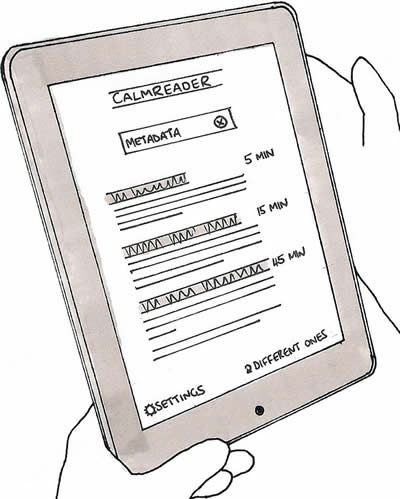
An estimated reading time accompanies each article, calculated from its word count. It’s harder to estimate the scale of a digital work than its physical counterpart, since we can’t skim to the end or feel the paper it’s printed on. The reading time estimate helps users to fit reading around their schedules, reducing the chance they’ll have to abandon an article halfway through. It also promotes the understanding that it’s OK to graze on short articles. Reading needn’t be just about marathons of concentration.
Article ordering is particularly important to CalmReader. The reverse chronological order – newest on top – seen in Instapaper and Readability doesn’t suit the calm mindset. Since newer articles persistently suppress older articles, reverse chronology risks creating a backlog of articles that you never get round to reading. Thus reading becomes equated with embarrassing procrastination. Instead of the full backlog, CalmReader shows just three articles when opened, guided by an algorithm that balances randomness, popularity and recency (more on that below). It displays the first few sentences to jog your memory and help you decide, but if these articles don’t take your fancy, tap the Different ones link and it will refresh the list.
This cherry-picking approach is deliberately non-comprehensive, meaning that CalmReader acts more as a reading suggestion service than a library of everything you’ve bookmarked. One downside of this approach is that it potentially hinders findability of specific articles. Scale exacerbates the problem: if you’ve added hundreds of articles, a graphical interface soon becomes cumbersome. Therefore, search plays a central role in CalmReader. Users can enter a search query to help them find a specific article (“Bahrain”), or to find articles that contain topic keywords of interest at that moment (“sport”, “design”, “pop”). To add richness, CalmReader adds hidden tags to each new URL (using the Delicious API, for example) – so a topic-based search like “Middle East” still retrieves articles that don’t feature the specific text.
We might also use APIs to harvest popularity metadata from social services such as Tweetmeme or Reddit. CalmReader then displays a simple preferences screen to allow users to give gentle weighting to either popular or lesser-known articles, for users who want to stray off the beaten track. Users can also bias the selection algorithm toward older or fresher material. This potentially complex weighting algorithm is largely hidden from the user. No need to expose the inner workings; it’s a simple reading app, after all.

So there we have it: just an experiment, and not one I’ll build (feel free to build it yourself if you like – ideas are cheap). But it’s interesting to consider how a few small design tweaks might fundamentally affect the nature of reading applications and remove some of the guilt that lingers around them. The world could use a little less stress.